Showing posts with label magazines. Show all posts

Wednesday, 11 April 2018

Blues & reds by Schuyler Samperton Textiles

Blues and reds by Schuyler Samperton Textiles · Lisa Stefan


When my face is not buried in a book you will probably catch me admiring patterned textiles with fascinating motifs (I often wish I had studied decorative art). This week I learned that new designs are soon being added to the fabric collection of Schuyler Samperton Textiles, which launched last year. I'm waiting with bated breath. On the blog I have already introduced some of her patterns and today I'm showing you my mood board of blues and reds, highlighting the Overlea, Cordoba, and Nellcote fabrics. Also, giving you a glimpse into the interior of Lamb's House in Leith, a House & Garden UK feature from 2016.

First, the textiles. The blue and red floral fabric is Overlea and this colourway is called Vermillion. I intend to decorate a nook in my own home with this particular fabric, after I have finished purchasing certain essentials. I also think it would make a beautiful tablecloth. Marine is the name of its blue colourway, next to the bedroom image. The other folded blue fabric is Cordoba in Indigo; the design has a paisley motif. The striped fabric is Pendleton in Brighton.

The Nellcote fabric is another design that I have already shared and cannot get enough of. The fabric sample with the tag shows its blue colourway, called Montego. You can spot it in Apricot, my personal favourite, in the top-right corner (the blue fabric thereunder is Firefly in Deep End). In previous blog entries featuring Samperton's textile design I have included the Doshi pattern; spotted under the cup of latte is its blue colourway Lake. Please follow the links to view the colourways of each fabric on the website of Schuyler Samperton Textiles.

Lamb's House living room, House & Garden UK · Davide Lovatti | Books & Latte
From the pages of House & Garden UK: Lamb's House living room/Davide Lovatti

The bedroom in my mood board belongs to the restored Lamb's House in Leith (Edinburgh), which was built in 1610. The owners are conservation architects and it so happens that the wife, Kristin Hannesdottir, is a fellow Icelander. I remember falling flat for this space, its textiles and exposed beams, when I first saw the house tour featured in House & Garden UK, beautifully photographed by Davide Lovatti. Here you can also view the living room and Kristin's studio, which has a barrel-vaulted ceiling made of Siberian larch. If you're interested in reading about the restoration and viewing more images, simply follow the link.

Lamb's House studio, House & Garden UK · Davide Lovatti | Books & Latte
The studio of conservation architect Kristin Hannesdottir at Lamb's House/Davide Lovatti

top image by me | credit: House & Garden UK, December 2016 · Davide Lovatti


Wednesday, 17 January 2018

Textiles and Persians

Schuyler Samperton Textiles · Lisa Stefan


If you thought this blog entry was about Persian textiles you have been lured to the blog on false pretences; I'm referring to my Persian cat, who did some serious photobombing the other day when I was photographing patterned fabrics by Schuyler Samperton Textiles. It was a relaxing day, with the sun in hiding but every now and then brightening up our reading nook quite generously, and I had spread books, interior magazines and fabric samples all over the coffee table. There was coffee too.

A certain colour palette had formed in my head and all of a sudden I realised how beautifully it harmonised with the January 2018 cover of The World of Interiors. I picked the fabric samples needed, grabbed the camera, and had shot perhaps four or five photos when my Persian prince appeared on the scene ... and refused to budge (I should have known, he likes sleeping in between my books). I tried to work around him but he kept popping up in the frame. The last photo shows the end result: he had his way and I called it a day.

Schuyler Samperton Textiles · Lisa Stefan
Caledonia, Doshi and Firefly fabrics by Schuyler Samperton Textiles

Back to that colour palette. I chose three designs by Schuyler Samperton Textiles. The floral fabric with the bird motif is called Caledonia, seen here in the colourways Peony (above in the foreground) and Imperial (under the cup). The design with the loosely printed botanical motif is Doshi, in the colourways Hibiscus and Aubergine. Sandwiched between the two is the Firefly in Plum. In blue it's called Deep End.


A Persian prince enters.

The World of Interiors & Schuyler Samperton Textiles · Lisa Stefan
Bedroom image from The World of Interiors, January 2018/Simon Upton

The cover photo of the January 2018 issue of The World of Interiors was lensed by Simon Upton. The magazine visited the home, a transformed warehouse in Milan, of art director Roberto Gerosa. The bedroom is textile heaven.
Persian cat sleeping & Schuyler Samperton Textiles · Lisa Stefan


All's well that ends well.


Monday, 13 February 2017

A last sentence by Tanizaki | Virginia Woolf

A last sentence by Tanizaki | Virginia Woolf · Lisa Stefan


I don't know about you but in bookshops I often find myself reading the first sentence of a book or its first paragraph; never the last sentence, as it could give away the ending, but I know people who do. In January I finished reading The Makioka Sisters by the Japanese writer Jun'ichirō Tanizaki (1886-1965), translated by Edward G. Seidensticker (an Everyman's Library edition). Without giving away its plot, I have to share with you the book's last sentence: 'Yukiko's diarrhea persisted through the twenty-sixth, and was a problem on the train to Tokyo.'

Do you need to read it again? I did.

Usually when I finish reading a book I contemplate on the characters, plot, theme, etc., and perhaps write a few lines in my notebook. This time my mind was going, Okay, is there a chapter missing? Is this the ending? I honestly turned the book upside down - I believe I even shook it gently - in the attempt to find that missing final chapter. And when I realised that this was it, this was indeed the last sentence, I just burst out laughing. This is the single most memorable last sentence I have ever come across.

I'm still looking at that page and laughing; this last sentence is so unexpected.

The prose of The Makioka Sisters is very calm (during the reading I told friends it often felt like meditation). I don't remember a book with such a quiet prose. It's quite long, divided into three books, but I enjoyed it. Basically, it's about the search of the Makioka family for a husband for the third sister so they can marry off the fourth and youngest, who already has a suitor. The theme is like any Jane Austen novel but the style is completely different. It's an interesting social study of Japan, its culture and customs, in a certain era: It starts in 1936 and ends in April 1941; Europe is already at war but the attack on Pearl Harbor hasn't happened. When you finish reading the book you know that there are major changes ahead.

The Makioka Sisters was on my № 6 reading list and I told you then that I was noting down ideas for a Japanese list. On that one you will find The Tale of Genji by Murasaki Shikibu, a Japanese classic from the 11th century, often referred to as the world's first novel, translated by Tanizaki into modern Japanese. On the list you will also find Tanizaki's Some Prefer Nettles - I won't tell you more until I share it.

From a Virginia Woolf feature, 'Bloomsbury & Beyond', Harpar's Bazaar UK, March 2017, pp. 324-25

You may already have seen the Vanessa Bell feature I shared on Instagram last week, from the March 2017 issue of Harper's Bazaar UK. It's been months since I last bought a fashion magazine but almost ran to the shop when I learned that the cultural section of this one included both Bell and her sister Virginia Woolf. The Woolf feature is called 'Bloomsbury & Beyond' and opens with a photo of her desk at Monk's House, her home in Sussex (spotted in my top image), and ends with her short story The Lady in the Looking Glass, which appeared in the magazine's January 1930 issue. An inexpensive Penguin edition of The Lady in the Looking Glass also includes her stories A Society, The Mark on the Wall, Solid Objects, and Lappin and Lapinova. The last one appeared in the April 1939 issue, which you can spot in the top-left corner of my image above. If short stories are your thing I believe all the ones by Woolf are available online.

images by me | credit: Harper's Bazaar UK, March 2017 · Harry Cory Wright | map of France from the book Map Stories: The Art of Discovery by Francisca Mattéoli (Octopus Publishing Group) © Bibliothèque Nationale de France


Friday, 17 June 2016

№ 2 reading list: bookshelf styling

№ 2 reading list: bookshelf styling · Lisa Stefan


I have a bookshelf crush. Not my first. The July issue of Elle Decoration UK has a feature that has had me swooning just a little with my coffee, a home in LA that has so many right touches ('House on the Hills', photographed by Stephanie Bjelkstam). The open shelves in the living room display an uncluttered mix of books and decorative objects; books arranged both vertically and horizontally, adding visual interest. The shelves seem to breathe and echo the rug on the floor. Beautifully done. These days I'm reading a few books and soon I will be reviewing one of them on the blog: Decorative Textiles from Arab and Islamic Cultures: Selections from the Al Lulwa Collection. That Egyptian cotton appliqué to the left is a little preview.

My summer reading list is ready (I should probably call it my early summer reading list) and consists of plays and autobiographical writing. Recently I returned playwright Arthur Miller's memoir Timebends (wonderfully written, highly recommend it) to the library and picked up two of his plays. On the same day I was browsing online for works by Virginia Woolf and was lucky to find two used copies (vol. 3 of her diary has arrived and looks like new - love it). Here is my list:

1  All My Sons  by Arthur Miller
2  Death of a Salesman  by Arthur Miller
3  Off the Road: Twenty Years with Cassady, Kerouac and Ginsberg  by
Carolyn Cassady
4  The Diary of Virginia Woolf - Volume 3: 1925-1930  edited by Anne
Olivier Bell
5  The Letters of Virginia Woolf - Volume II: 1912-1922  edited by Nigel
Nicolson and Joanne Trautmann)
6  Testament of Youth: An Autobiographical Study of the Years 1900-1925 
by Vera Brittain

Some people would perhaps call this a bit heavy reading in summertime but I'm just not one of those readers who pick up a stack of quick-reads at the local bookshop. My children were making fun of me recently, saying that I read weird books. I'm trying to remember the exact phrase one of them used, 'English upper-class snob literature' or something like that. It cracked me up.


On a more personal note: It's the National Day of Iceland and my husband and I celebrate our 18th wedding anniversary. It's also Friday pizza day but he's abroad for work. The children and I are going for French cheese, baguette and grapes ... and chocolate. Have a wonderful weekend!

images by me | credit - top photo: Elle Decoration UK, July 2016, p. 116 · Stephanie Bjelkstam


Wednesday, 27 April 2016

Interior design: Purple shades and original tiles

Interior design: Purple shades and original floor tiles · Lisa Stefan


You know those pages in magazines that you keep coming back to? For me this is one of them. The bedroom belongs to designer Stefano Guidotti's home by Lake Como in Italy that was featured in the April issue of Elle Decoration UK ('Como in Colour', photographed by Mads Mogensen). In his own words he is obsessed with colour and thought of the original patterned floor tiles as huge rugs when decorating his home. The shades of his walls are beautiful and he has a wonderful selection of decorative objects. If you can get a hold of the issue then check out the leather sofa in the living room and the colour of his dining area. Such an inspiring house tour!

image by me | credit: Elle Decoration UK, April 2016, p. 167 · Mads Mogensen

Wednesday, 2 March 2016

Deborah Turbeville's 'Casa No Name'

Deborah Turbeville's 'Casa No Name' · Lisa Stefan


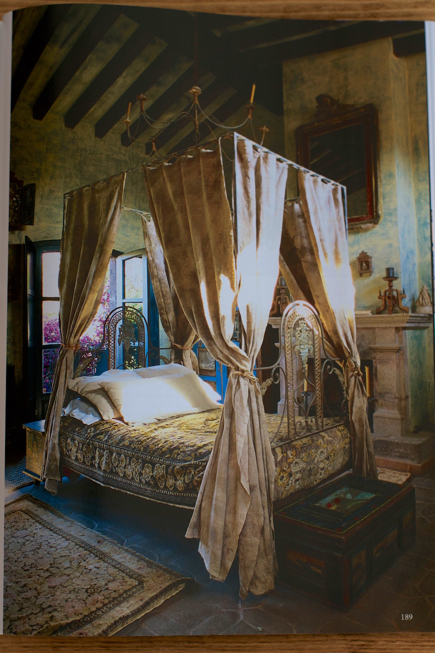
Last Friday I told you I had snapped a few photos of a Mexican home that I promised to share. The house tour appeared in the December 2015 issue of The World of Interiors, in a feature called Destination unknown, lensed by Ricardo Labougle. The house belonged to the late fashion photographer Deborah Turbeville (1932-2013), who lived a nomadic life. She named it Casa No Name. It's located in the historic city San Miguel de Allende, in Guanajuato. When Turbeville bought the house it was in a terrible state, but if you are familiar with her photography it is easy to understand why it fascinated her. A friend of hers, who oversaw the two-year restoration told the workers to 'not ... make too perfect a job of it, for "The señora likes it that way"' (p. 190). There is no one thing that draws me to this house; it's the richness of it that captivates me, the gorgeous blend of patterned textiles, colours, plaster walls, the breathtaking roof terrace . . . this is what they mean when they talk about turning a house into a home.
Deborah Turbeville's 'Casa No Name' · Lisa Stefan


In 2009, Rizzoli published the book Casa No Name by Turbeville herself. I have seen some of the images from the book and I cannot say it's a book for everyone. Let's just say that it's a different interior design book with a lot of blurry images. Hard-core Turbeville fans will probably love it.

I found a short interview with Turbeville on YouTube, taken at Casa No Name when Toast was shooting their Spring/Summer 2010 lookbook there.
Deborah Turbeville's 'Casa No Name' · Lisa Stefan


For everyone interested in fashion photography I would recommend the book Deborah Turbeville: The Fashion Pictures. It's also published by Rizzoli and you will find in it the infamous bathhouse photos, which shocked when they appeared in Vogue in 1975.
Deborah Turbeville's 'Casa No Name' · Lisa Stefan


images by me | credit: The World of Interiors, December 2015, Destination unknown, pp. 182-191 · Ricardo Labougle

Wednesday, 17 February 2016

Interior design: Letting the outdoors in

Interior design: Letting the outdoors in · Lisa Hjalt


The March 2016 issue of Elle Decoration UK is filled with many interesting features and has made up for the disappointing March issue of The World of Interiors, which is another story (don't get me started on the cover!). One of the house tours in Elle Decoration that I liked was of a beautiful apartment in Lyon that has been circling in the blogosphere (it also appeared in the Australian magazine Vogue Living where you can view all the images). Another tour that appealed to me was of a contemporary townhouse in Cologne with Asian-inspired influences (see Den of Zen on journalist Kristina Radershad's website). No worries, I'm not going to tell you about every feature in the issue but the reason I snapped a photo of that dining area is that we are heading for spring and I'm a fan of letting the outdoors in when it gets warmer ('The Borrowers', a flat in Milan photographed by Fabrizio Cicconi). Apart from its mismatched floor materials, the flat itself is a bit too quirky for my taste. However, this space is also a kitchen and I like the idea of being able to open the doors onto a large balcony and perhaps feel a light breeze while dining or enjoying a cup of coffee in the morning.

image by me | credit: Elle Decoration UK, March 2016, p. 186 · Fabrizio Cicconi

Wednesday, 27 January 2016

A time well spent

A time well spent: coffee & Karen Blixen · Lisa Stefan


I have a confession to make. This morning was rainy and dull and with time on my hands I thought it best to finish organising the rest of our clothes. A chest of drawers in our bedroom is still empty after the move and there are still clothes in boxes. It all started well but then I longed for a cup of coffee and probably made the mistake of bringing it upstairs. Before I knew it I was sitting on the rug with books and magazines, and the film Out Of Africa (1985) running in player. I have no excuse. Most of the drawers are still empty but I believe my time was well spent. In my opinion it cannot be a waste of time if it leaves you inspired.

Lately I have been watching Out of Africa a lot. I don't sit with my eyes fixed on the screen, I just let it run in the player and watch it with one eye or listen while I'm doing something else. I often keep the director Sidney Pollack's commentary on because I never grow tired of what he has to say about Karen Blixen, Kenya and how they shot the film. He doesn't only talk about particular scenes, as most directors do, he goes deeper and I love his way of storytelling. Maybe this is just my way of holding on to his voice after his death. Anyway, it's a film I have watched so many times that I can no longer keep track, but each time I do I'm drawn to different scenes. This morning it was the relationship between Blixen [Meryl Streep] and her Somali servant Farah [Malick Bowens], who was with her the entire time she lived on the farm in Kenya. Their conversations aren't long but the scenes are delightful and often witty. In her book Shadows on the Grass she refers to him as her "servant by the grace of God" and I think Pollack's film captures the meaning of it beautifully.
Out of Africa by Karen Blixen · Lisa Stefan


About my rereading. Karen Blixen's Out of Africa is one of the books I have been reading again. I was thinking about it the other day that the more I see of the stuff people share on social media - selfies and pointless websites, dare I say stupidity? - the more I feel the need to take a step back and revisit either quality books or films. They help to cleanse the mind of rubbish articles and unwanted images out there.

A note on my photos: Top photo shows page 133 in the Dec. 2015 issue of The World of Interiors (taken by Andreas von Einsiedel). The article 'Window on the World' is about the late Julian Barrow, an artist and world traveller, who had a studio in Chelsea. The patterns are from V&A Pattern: Indian Florals. The bottom photo shows a page in the same issue of WoI. The article, 'Bauhaus Below the Border' which starts on page 66, is about Josef and Anni Albers. The exhibition A Beautiful Confluence: Anni and Josef Albers and the Latin American World runs at the Museo delle Culture in Milan until 21 Feb.


Thursday, 24 September 2015

Iznik pottery | Pear muffins

Iznik pottery | Pear muffins · Lisa Stefan


There are a few things to be happy for this September. A new coffee house in the next village pleasantly surprised me with stylish interior design: rustic style meets industrial. I'm finding an excuse to bicycle to the post office more often only to sit down with a book and a latte before heading back home. Then there is a feature on Iznik pottery in the latest The World of Interiors issue with mesmerising motifs and colours. Downton Abbey is back with an interesting storyline and gorgeous costume design. Did you notice Lady Mary's blue kimono-style robe? What else? The heavenly scent of pear muffins baking in the oven. The little things ...
Iznik pottery · Lisa Stefan


Let us start with that feature in the October issue of The World of Interiors, where art historian John Carswell reviews the catalogue The Ömer Koç Iznik Collection by Hülya Bilgi (600 pages, weighs 5 kilos, sold by John Sandoe Books). It shows the Iznik pottery collection of the Koç family, the wealthiest in Turkey. In his interesting review, Carswell briefly tells the story of the Iznik pottery industry from the beginning of the 15th century until its end 300 years later. In the old days, the formerly Byzantine town Iznik, 100 km south-east of Istanbul, flourished because of its position on the main trade route across Anatolia (Asia Minor) from the East. Today it's a 'sleepy little town' but in the late 13th c. it was 'one of the first centres occupied by the Ottoman dynasty'.

The images accompanying the article show fascinating motifs on tiles, jugs and dishes, painted in vivid colours. According to Carswell, the hallmarks of Iznik design were cobalt blue, turquoise, manganese purple, olive green and red. 'The designs combine purely Turkish motifs with elements transposed from imported Chinese blue-and-white porcelain' and he adds later that '[w]e have no clue why they chose a specific set of motifs and combined them in such a distinctive and particular way.'
Iznik pottery · Lisa Stefan


If you happen to be travelling to Turkey you may want to visit the Topkapi Palace in Istanbul, to enjoy Iznik tiles. The aforementioned catalogue isn't within my current book-budget but for those interested I found two less pricy books online that I would like to have a look at and perhaps offer a permanent place on my coffee table: Iznik Pottery and Tiles: In the Calouste Gulbenkian Collection by Maria d'Orey Capucho and Iznik: The Artistry of Ottoman Ceramics by Walter B. Denny.


I'm not quite done with patterns. Series 6 of Downton Abbey is upon us and I am head-over-heels in love with Lady Mary's blue kimono style robe that Michelle Dockery wore gracefully in a few scenes in the first episode. I tried to find images of it online to see the pattern in detail, but I had no luck so I just paused a scene on the ITV Player and snapped photos of my tablet (please excuse the poor quality).

I don't know whether the robe/kimono is vintage or especially designed for the show but I love its cut and colour. I think costume designer Anna Robbins is doing a great job with displaying the style of the 1920s. I have to admit that the exhausting plots of the last Downton Abbey series almost made me give up on the show but I'm glad I gave it a chance on Sunday. That first episode was promising ... at least the costumes.


Spotted in these images: Benaki wallpaper sample in blue mink (LW 198381) by Lewis & Wood
and Wild Thing fabric sample in copper cobalt (LW 188335)

October is approaching and autumn is just around the corner. It's time to embrace the season and turn the pears into muffins. You should have seen my children's happy faces the other day when these were waiting for them after school.
Recipe: Pear muffins · Lisa Stefan


These muffins are moderately sugary and stuffed with pears. Someone asked me recently why I use gluten-free baking powder when I bake with flour containing gluten. The simple reason is that the gluten-free baking powder from Doves Farm is my favourite. I don't like regular baking powder, which always seems to have an annoying aftertaste (use 50% less in the recipe if using regular). A note on choosing between the buttermilk and pureed pears for the wet mixture: It depends on whether the pears I use are juicy or slightly firm. If they are firm I like using pureed pears (I buy Hipp Organic jars in the baby food section), which give the muffins a richer pear taste. If using juicy and sweet pears I make my own buttermilk with milk and lemon juice (see tip below). American readers please note that 1 cup of flour is about 125-135 grams, which means there are about 2 cups in the recipe, depending on the type you use.

PEAR MUFFINS

3 medium-sized pears
1 large egg, free-range
75 g organic unrefined cane sugar (¼ cup)
1-1½ tablespoons honey (or pure maple syrup)
1½ tablespoons coconut oil
60 ml buttermilk or organic pureed pears (¼ cup)
200 g white spelt flour (or organic plain flour)
50 g wholemeal spelt flour
2½ teaspoons baking powder, gluten-free
¼ teaspoon fine sea/Himalayan salt
½ teaspoon ground cardamom
¼ teaspoon ground nutmeg
optional: a pinch of ground cloves

Peel and core the pears before chopping them finely. Put them aside.

Whisk together the egg, sugar, honey, buttermilk/pureed pears, and coconut oil in a bowl (if the coconut oil is solid place the closed jar in a bowl of hot water before use). If you are making home-made buttermilk let it sit in the measuring cup for a few minutes and whisk it in when it has thickened.

Measure the spelt flour, baking powder, salt and spices into another bowl.

Fold the wet mixture gently into the dry one with a spoon or a spatula and then gently stir in the finely diced pears. At first the batter may appear dry but the pears will add moisture.

Lightly grease 12 silicone muffin cups with coconut oil, spoon the batter into them and place the cups in a muffin tin. Bake at 200°C/400°F (180°C fan oven) for 22-25 minutes. When the muffins are ready, wait for a few minutes before removing them from the silicone cups and then place them on a wire cooling rack.


Uppskrift á íslensku.

If you rather want to use buttermilk instead of pureed pears, it's very easy to make your own. Pour 60 ml (¼ cup) of milk into a measuring cup and add to it 1 teaspoon of freshly squeezed lemon juice. Stir gently and let it sit for a few minutes until it has thickened.


Tuesday, 25 August 2015

Hydrangeas and September issues

Hydrangeas and September issues · Lisa Stefan


These days in late August give me pleasure: morning coffees, walks, mainly to enjoy blooming hydrangeas, slightly darker afternoons, and book reading by candlelight in rain or thunderstorms. Then there are the September issues. In my case, only one is a fashion magazine. The World of Interiors is as solid as ever; it always seems to leave me feeling a bit richer.
Hydrangeas · Lisa Stefan


A few years ago I very likely would have bought a few editions of Vogue (there are old September issues of the American, British, French, Italian, and German on my shelves) but at some point, I stopped. I hadn't really planned on buying Harper's Bazaar UK but when I leafed through it in the shop there was a feature that caught my attention, on Amanda Brooks and her beautiful country home in Oxfordshire. Brooks is the former fashion director of Barneys in New York.
September issues: Amanda Brooks · Lisa Stefan


I think my buying the issue had also something to do with the Vita Kin dress Brooks is wearing in one photo. I'm fascinated with the design, patterns and embroidery, of these traditional Ukrainian garments - vyshyvanka. I wondered if I would grow tired of them now that everyone seems to be wearing them but it doesn't look that way. These are classics.

September issues: Amanda Brooks · Lisa Stefan


Apart from beautifully styled and photographed editorials that tell a story (often hard to find), there really isn't much in fashion magazines anymore that particularly appeals to me. I'm referring to the fashion part. I think I have grown out of them and I'm weary of the way fashion is presented. What's with these endless label-orientated collages of the pieces of the season that always look the same? I'm much more interested in the design process itself and what inspired a designer's collection. That's why I was pleasantly surprised with an interview with Maria Grazia Chiuri and Pierpaolo Piccoli, the creative directors at Valentino. Just look at their mood board below for this year's autumn collection. This is what I want to see.
September issues: Valentino mood board · Lisa Stefan


In the interview they honour the relationship with their seamstresses, who 'put their own passion and love into the collection. . . . There is a lot of care in every single dress, in every single detail, and you feel that it is something very precious' (p. 313). They have added a third couture atelier and are training young people to learn the skills. As Chiuri points out: 'There is a dignity in this job, but it is also fun to see a punky girl in her Doc Martens working beside a 60-year-old lady in slippers - two generations together, sharing the knowledge and expertise' (p. 314). You can view a few Valentino design details on my Tumblr page.
September issues · Lisa Stefan


Another enjoyable article was about Diana Vreeland, the legendary fashion editor, written by British historian Kathryn Hughes (her biography of George Eliot is on my wish list). A new book about Vreeland will be published by Rizzoli in October, Diana Vreeland: the Modern Woman: The Bazaar Years, 1936-1962, edited by her grandson Alexander Vreeland.

September issues: The World of Interiors · Lisa Stefan


There were plenty of features in The World of Interiors that appealed to me. One in particular, about a Mexican ranch bordering Arizona, owned by designers Jorge Almada and Anne-Marie Midy of the Casamidy furniture company. Think traditional rugs with diamond patterns and leather chairs. Midy describes the surrounding landscape as 'green after the summer rains, but bleached pale gold by the autumn' (p. 130). I want to sit on that veranda and take it all in.

September issues: The World of Interiors · Lisa Stefan


An article about Caffè Stern in the Passage des Panoramas in Paris made my heart beat a little faster because of Picasso cushions that are part of the décor (see one in the above photo to the left). I cannot remember when I first fell flat for them. The covers are woven by hand and handcrafted in Flanders, created in collaboration with the Picasso foundation. A few covers are available in The Conran Shop in London.

Soon the kids go back to school and the bright colours of the hydrangeas will start to fade. Eventually, the tree leaves will start to turn. Part of me looks forward to crisp autumn mornings; another part hopes for an Indian summer.


[Update: Because of a comment below about the olive textile sample and an email I received about the red one: All samples in this post are from Fermoie. The olive green is Rabanna (L-077), the red is Marden (L-275), and the striped ones spotted in one photo are York Stripe (blue L-173, red L-016). These are all 100% cotton. All info on the yellow one spotted in a few photos is in my blog post yellow fabrics by Fermoie.]